The Light Behind the Logo
The OCCS logo is a familiar symbol at our school, but have you ever wondered about its significance? Read on as Mr. Van Schepen, technology coordinator and teacher, takes us through the many layers of symbolism in our school logo.
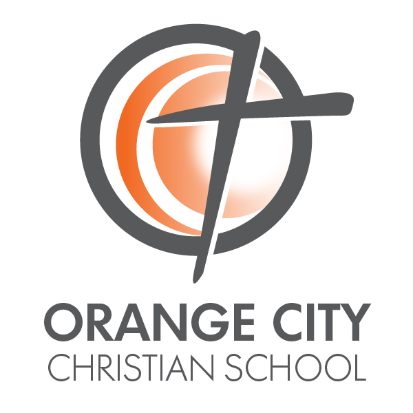
When I first came to OCCS to teach back in 2013, I was introduced to the new OCCS logo. It was featured on letterhead, attached to signature lines on emails, and was even promoted on apparel items so we could “wear shirts with the NEW OCCS logo.” I have to admit, the logo did look nice. What stood out to me was that the logo featured a cross and the words “Orange City Christian School” below. There was more to it (like being orange...but that one I could figure out the meaning behind!) but I really never gave it another thought until I had the opportunity to teach 8th grade computer class during the 2017-18 school year.
The focus for the year-long course was using technology for designing. Students created websites, learned how to code, programmed robots, printed 3D objects, and...looked at the design of corporate logos, what they portray, and how they’ve changed. Logos have a purpose to them. Some of them, like Coca-Cola, haven’t changed much over the years. Their distinct script font has become a trademark symbol of longevity for the company. Newer logos, like that of Google, use simple block fonts with basic colors to show the ease and simplicity of their product. Still others use hidden symbols that you don’t pick up on unless someone points them out to you. For example, FedEx wants you to know they’re always moving forward, so they have an arrow in their logo. Amazon not only wants you to be happy while shopping with a smile in their logo, but they want you to know that they sell everything from A to Z. (I’ll pause while you look up those logos...you’ll never look at them the same way again!)
This is where the OCCS logo comes back into the story. While doing some research for class, I wondered about the meaning behind our logo. Why are certain shapes used? What message is our logo portraying? What meaning is hidden in the colors and symbols? Let’s break it down by symbol.
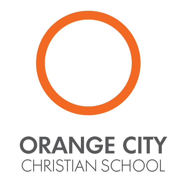
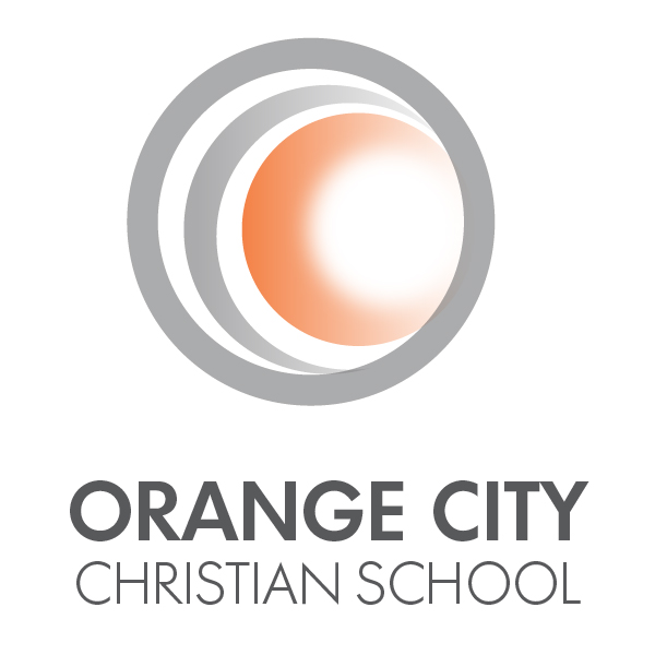
First of all, there is the "O," found in dark grey on our logo (but highlighted in orange for you to see) and the white crescent-shaped "C" just inside of it. The "O" and the white "C" stand for Orange City, the community in which we live, work, worship, play, and, in my case, teach. We love our town. We love the people in our town. The mission of OCCS is to educate students "to serve in Christ's Kingdom." We know that His Kingdom reaches far beyond the city limits, but our mission is based right here with the families that we serve. The outer "O" also shows our inclusiveness as a school. We believe each child that comes in our doors is one of God's children, and we educate them with a Christ-like perspective no matter their ability or where they come from.
"What message is our logo portraying?"
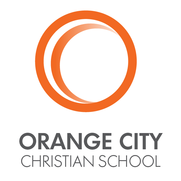
Next, we move to the orange "C," which creates the negative space for the white “C." It stands for "Christian," as in the third word of our school’s name. As in “professing Christianity and its teachings." The word “Christian” doesn’t just mean we read the Bible within the walls of our building. It means we believe that Christ is in everything we do. No part of our day, our work, or our play is absent from Christ’s presence, including education.
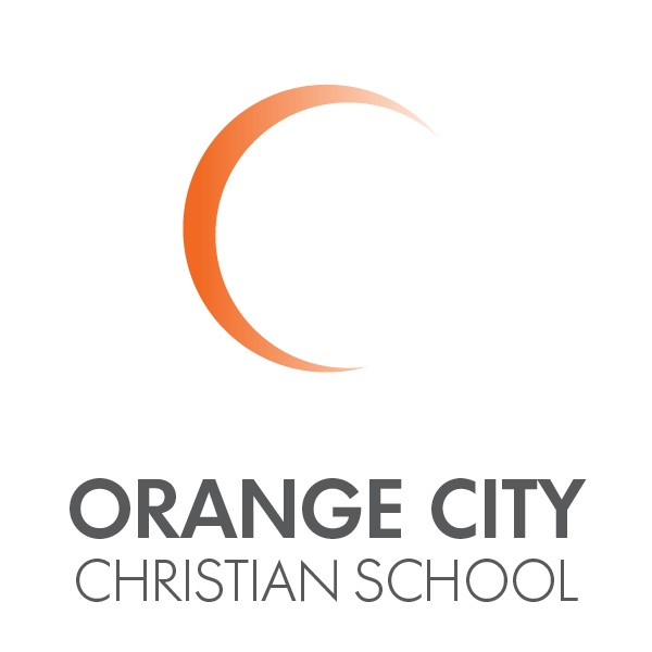
We then notice that the circles seem to be coming out from a source--a glowing light that appears to be creating ripples as it moves outward. That source is Christ, the Light in our world, the Center of everything we do. He is Truth. Our students learn that the only truth comes from Him.
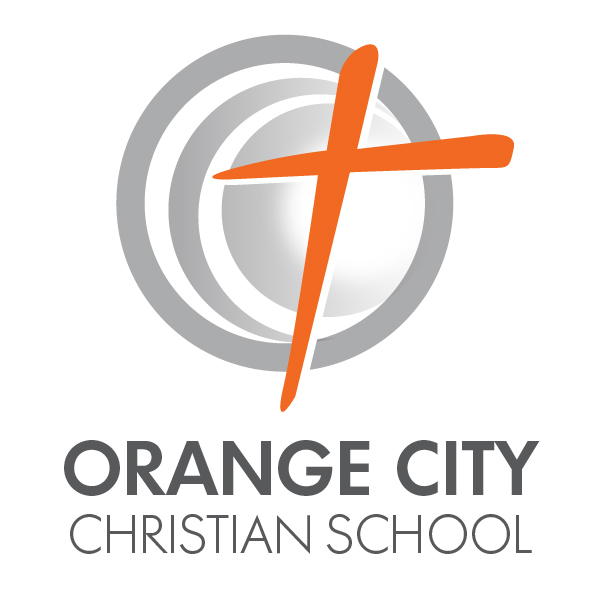
On top of that light is the cross, a familiar symbol found on the logos of many faith-based organizations. But it doesn’t simply link us to Christ. It symbolizes the pain, suffering, and death He endured on the cross as payment for our sins. We see the cross, and it reminds us that our lives are to be lived in never-ending service to those around us. You’ll also notice that the cross is in front of the light. The cross came first, but behind it is The Light that gives eternal life to all.
When we talk about the meaning of logos and how they encompass what a company or organization stands for, I can think of no better logo to symbolize the mission at Orange City Christian School. We are a “biblically-based" (Christ at the center) "community" (Orange City) "that partners with parents, educating hearts and minds to serve" (the cross) "in Christ’s" (Christian) "kingdom.”
Special thanks to Jamey Schiebout for his work on designing the OCCS logo and his insight into how it was developed along with Jennifer Mulder, who created the images for this post.
Matt Van Schepen
Technology Coordinator
Middle School Science
OCCS Parent


Comments
Post a Comment